The idea of a home By red house

Unknown 9:28 PM

The house is entered through a large wooden door that leads to a rectangular hallway.  A settle Morris decorated with illustrations from the medieval German epic Niebelungenlied is to the right. The hallway is filled with light from the stained-glass windows. The dining room to the right contains the original hutch designed by Philip Webb, which has Gothic trefoil motifs and is painted in “dragon’s blood” (a deep red-brown favored by Arts and Crafts practitioners). The original rustic dining room table remains, along with the decorative arch in the brickwork around the fireplace.


: : love this post over at .oh joy. today. I would feel so at home in any of these homes, the light, the wood, the color pop, the simplicity, purposefulness, balance and of course the pop colors feels perfectly aligned with the things I try to create in my own home. turns out the homes are all Swedish, designed by Swedish interior firm Alvhem....no wonder I was drawn to the images.check out http://redhousedesign.blogspot.com/
Exquisite Wall Coverings from China

Exquisite Wall Coverings from China

Unknown 6:09 AM
Exquisite Wall Coverings from China:
This compilation of beautiful wall coverings shows an exquisite range of Chinese influenced murals, featuring cherry blossomed landscapes, hummingbirds and butterflies, alongside large floral wall decals, and sophisticated fleur-de-li motif wallpapers. Some are renders but they still give you a pretty good idea of how they influence the mood of a room.
large crystal chendelier led strip lights
Nature imagery provides a perfect backdrop in any room of the house; appearing almost as a window to the outdoors when hung behind a dining set, and acting as a softening element when placed behind banks of entertainment equipment and newfangled TV units, in a modern living room.
Chinese Cherry Blossom Wall Mural
Chinese Landscape wall mural decal
Modern wall mounted entertainment unit
Green white open plan living space
Pictures of flowers or trees work particularly well as a serene boudoir theme, especially when depicted in soft brush stroke style.
Contemporary chinese infuenced bedroom design
Pink white bedroom floral headboard
A decal is a fabulously quick way to form an extension of the headboard in the bedroom, creating a larger vignette for extra impact.
Floral modern wall design decal
These wow factor walls are the ideal way to add both color and interest to your interior design, with a large serving of artistic flair thrown in.
Pink white living room
Unique Hallway Design
If you would rather keep your walls a little more abstract, these gorgeous flocked papers bring swathes of similar impact and grace, though demand slightly less attention, in their repetitive prints and more subtle palettes,
white gray fleur de lis wallpaper living room
The elegant wallpaper designs work brilliantly in both contemporary and traditional settings, because despite their bold appearance, they manage to maintain a delicately refined air.
Neutral bedroom decor design
Via ruixi.tmall.com

A Happy Valentine’s Day

Unknown 2:35 PM
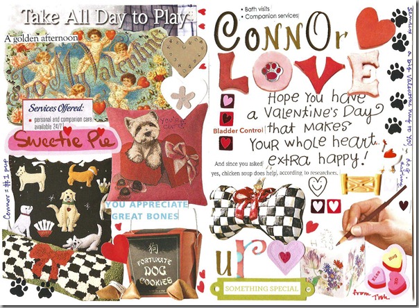
I received two of the very best Valentine’s Day cards… or should I say, I received one and Connor received one… from one of my dear readers who happens to be Connor’s BIGGEST fan. They are so lovely and personal, that I wanted to share them with you. Of course, you’ll be able to spot whose is whose pretty quickly – I hope!
Here’s the one:
valentine 002And here’s the other: valentine 001Aren’t they wonderful!!!  Thanks so much from both of us!
. . . . . . . . . . . . . . . . . . . . . . . . . . . . . . . . . . . . . . . . . . . . . . . . . . . . . . . . . . . . . . .
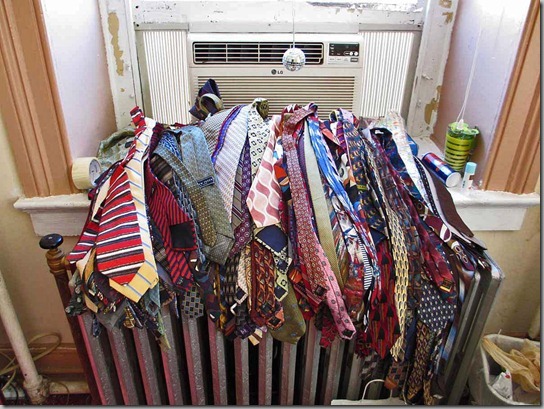
And in other great show of Valentine’s Day generosity… I talked about asking for ties and scarves for the boys and girls at Woodbourne the other day, here. Today, I did a tally of ties and scarves and we have received more than 700 in total!  (The pile was much bigger than this at the end of the day!)Wonderful readers of Pigtown*Design from as far as Toronto and Tennessee sent ties and scarves for the kids. We gave some scarves to the girls and they were beyond excited!  I printed up a little booklet on different ways to tie scarves, courtesy of Talbots, and they had a great time trying each of the styles. The boys will be showing of their tie-tying skills at an assembly on Valentine’s Day.
All of the boxes and bags are filled with scarves and ties!


More boxes filled with scarves and ties
Most of these children come to us with only the clothes on their backs, so to receive something special like a beautiful scarf really makes their day.
From Connor and me, and from the boys and girls at Woodbourne, Happy Valentine’s Day!

Materials: Ektorp Tullsta, Spare Crib Parts, Screws 2012

Unknown 7:06 AM
Description: I had a Tullsta chair I loved, it was just the right size for our nursery but I really wanted a rocking chair. I'm super cheap though so I went digging in the garage for something I could use as rocker runners. I discovered an old drop-side crib a friend wanted to take to the dump awhile back so I had asked if I could have it knowing I'd use the parts for something.


The sides had decorative curves (see photo above) so I took one side apart to get to 2 matching curved pieces. I then cut those curved pieces down to the right length. I determined the right length by cutting off anything that would get in the way of it rocking. That turned out to be just the right size. (photo below shows remaining scraps)


I then measured and cut other spare parts from that same piece of the crib to secure the rocker runners exactly parallel then screwed the whole setup into the bottom of the Tullsta chair (minus the legs).


I flipped the chair back over, scooted up my homemade rolling footstool, grabbed the baby and rocked him to sleep.
Luxury Interior Design

Luxury Interior Design

Unknown 1:50 AM

Tokyo is one of the cities which is having a big growth of the presence of high-rise luxury apartments. They are usually quite big an have very expensive decorating. This one in Roppongi Tower Atlas isn’t exclude. It’s expected to be completed in February 2017.
Because it’s situated on 13th floor it has great panoramic views. The interior designer adapted to that and placed the sofa near windows adding the opportunity to enjoy the view but not usual TV. Lighting system isn’t simple in the apartment. Besides lighting from ceiling there are indirect lighting, wall brackets, floor lamps and so on. So the lighting around the apartment is adjustable for any needs. The entrance hall has great bracket piece of Japanese paper art. Mirror glass walls make this piece viewable from everywhere near it. The bathroom besides bath has mirrors from both sides and TV built-in in the wall. Besides usual but great modern kitchen the apartment has the bar where owners could spent time with their guests. There is also big-screen TV to watch favorite sport games. When the building would be completed, this apartment would be great urban luxury addition to the Tokyo streets.
Big Apartment Interior Design In Tokyo

Big Apartment Interior Design In Tokyo

Big Apartment Interior Design In Tokyo


Big Apartment Interior Design In Tokyo

Big Apartment Interior Design In Tokyo

Maryland Antiques Show @ Hunt Valley

Unknown 7:17 PM
I attended the Maryland Antiques Show at Hunt Valley as the guest of the committee this morning and it was a great event. Soon after I arrived, the lecture with José Solís Betancourt & Paul Sherrill who were talking about their book, Elegant Transformations.hb-essential-elegance- They basically went through the book and talked about some of the projects they’d worked on, including a transformation so dramatic that they tore the house down!
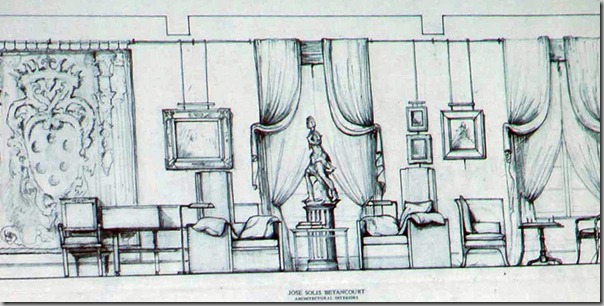
One of the houses in the book was a place they’d done in DC 20 years ago, and it looked as fresh as if it was done last year. A design element that I thought was brilliant was to hang artwork from bronze rails, and run the power cords through the rails, so there wouldn’t be any unattractive power outlets marring the walls.
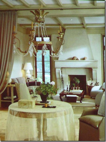
In this image, I particularly liked the gossamer-sheer covering on the hall table.José Solís Betancourt & Paul Sherrill’s main take-away was that your house should be so special to you that you look forward with great anticipation to returning home. What a great idea!
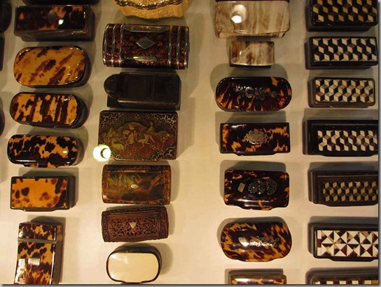
Following the lecture, I had a chance to tour the show. One of the first booths I came across was Rick Scott, from San Francisco, who featured the most wonderful selection of beautiful tortoise-shell and quill boxes. The detail work was just extraordinary and each piece had something to recommend it. I especially liked the little box made from the shell, in the center, above.
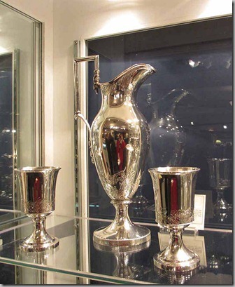
And how could I not love the beautiful silver at Spencer Marks from Southampton, Mass.! You can see the red from my sweater reflected in this ewer and cups. I can’t even imagine having to polish all of this silver, but it was stunning.
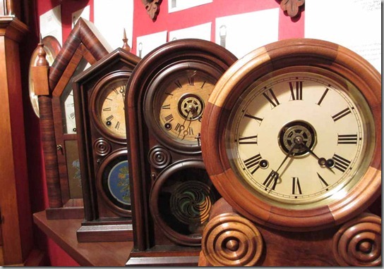
I loved these clocks from Lotz’s Antiques in St. Louis. A very contemporary look in a very old piece.
I had a chance to chat with Alan Cunha from Boston and Nantucket. I think that his was one of the booths that I liked most!  This chest is the 18th century version of my steel cabinet that holds shoes.I loved these glass pieces that are actually car headlights from the 1940’s. The yellow ones are fog lights, and the clear ones are headlights. Car buyers could choose the pattern for the glass.  Their simple frames and stands elevate them to art.
Another everyday item elevated to art was this set of moulds from Chanel and Tiffany used for casting pins and other small metal items. Just before I arrived, a woman came by and swooped up the lot of them.
I am a total sucker for garden antiques, and this display from Finnegan Gallery in Chicago really pulled me in. This summer, I am focusing on the garden at the house, but somehow, I doubt it will ever look this moody.One can only hope!
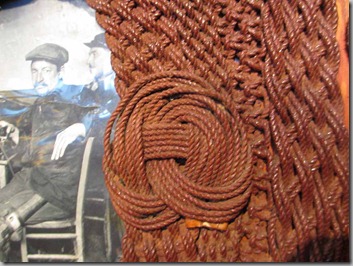
Another Nantucket dealer, Sylvia Antiques, had a great selection of nautical antiques.
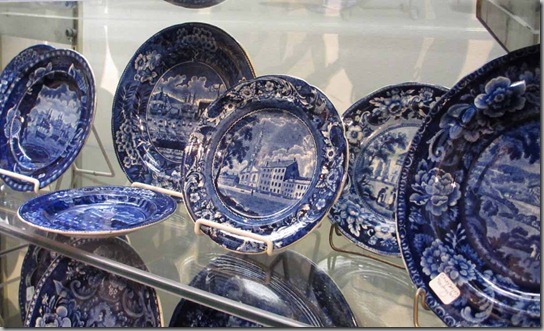
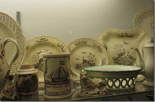
I especially loved this simple pitcher with the sailing ship.Of course, I am mad for china of all types, and saw some great transfer-ware. And in blue…And white…The show this year is the best it has been in years, so I thoroughly recommend that you attend if you’re in the area.
Details are here, and the show runs until Sunday, February 26th.